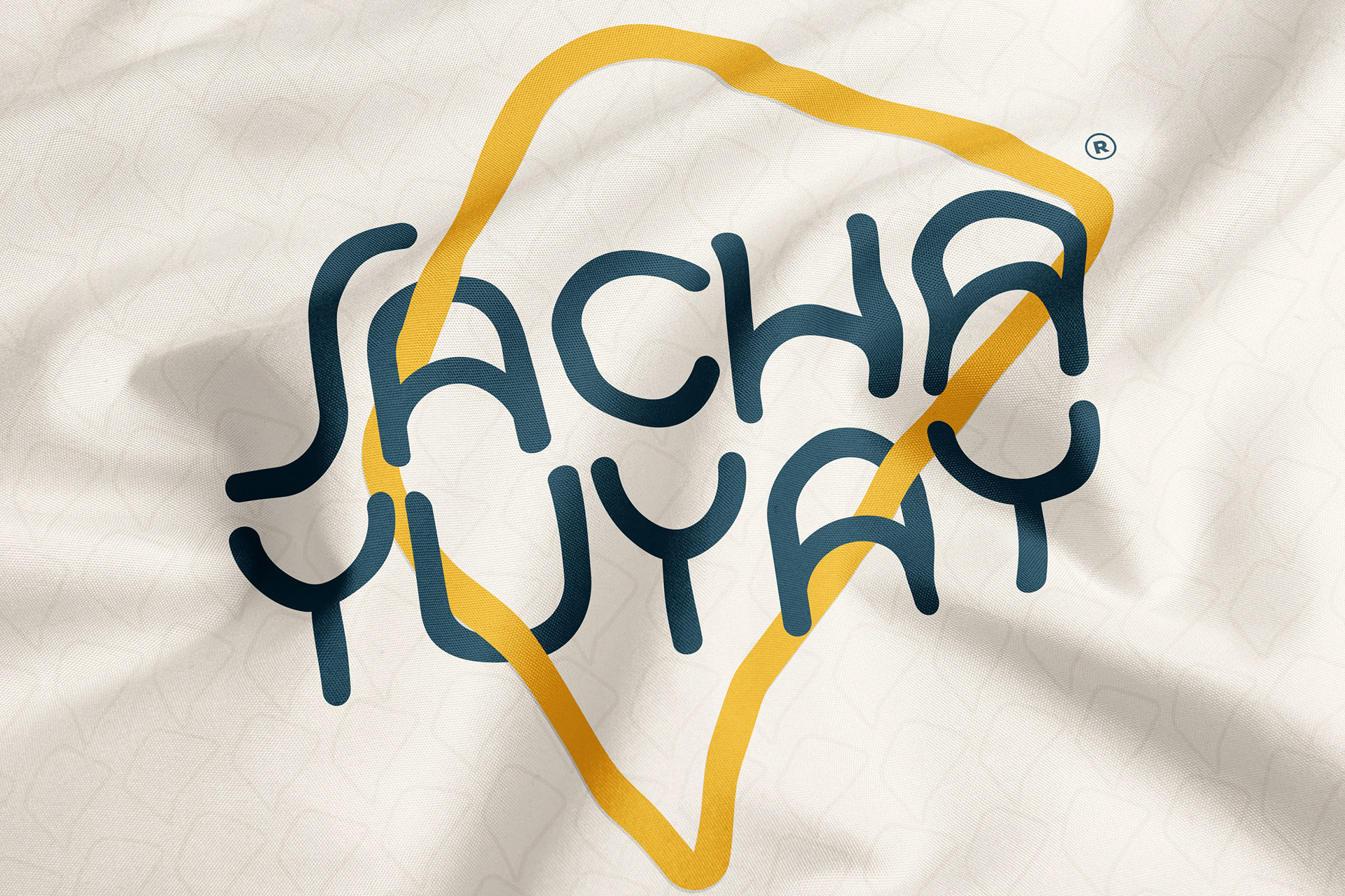
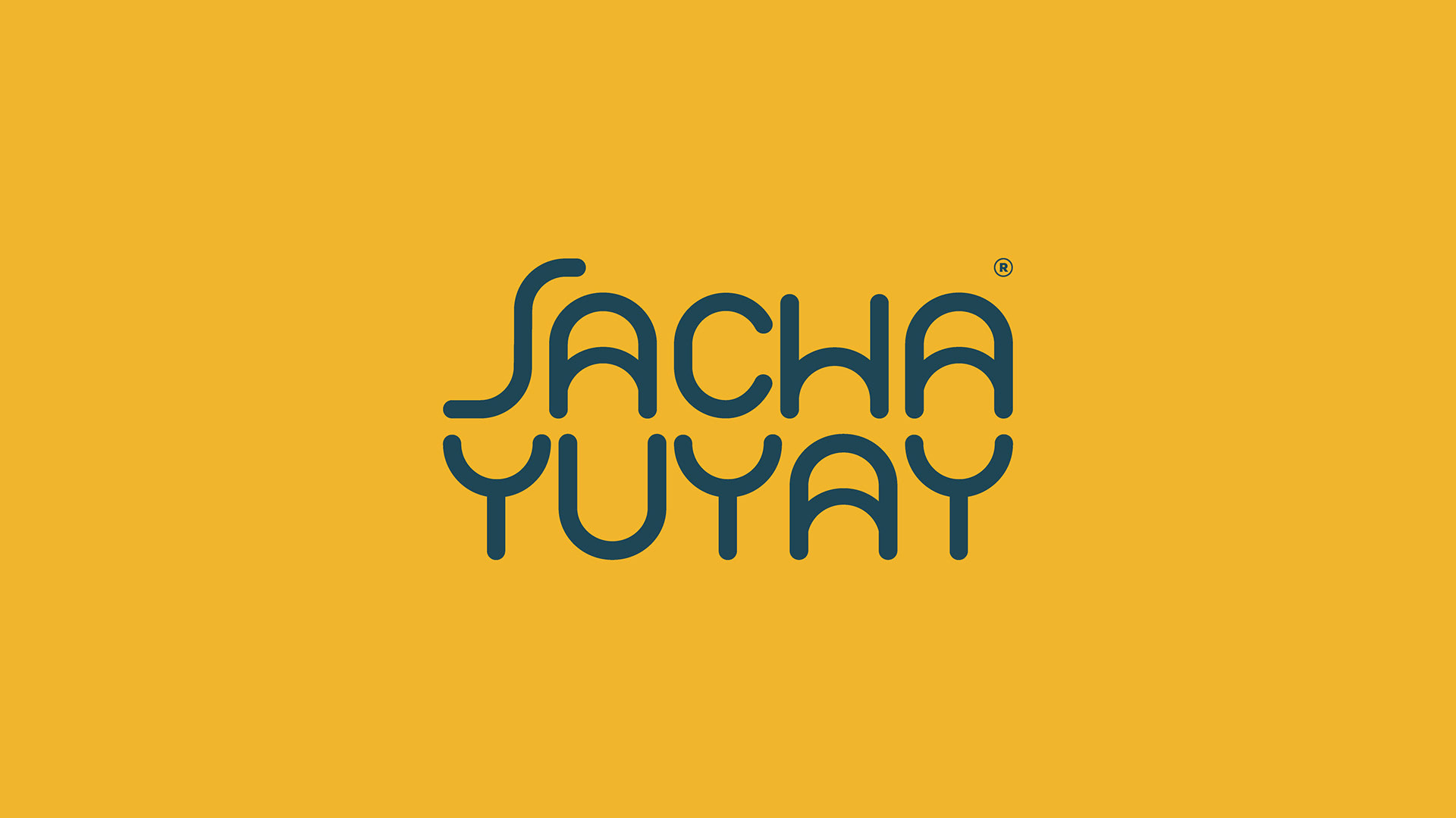
We have the chance to make the Rebrand of SACHA YUYAY.
SachaYUYAY is a laboratory of local enterprises based on an ecological and innovative concept in order to reinforce and promote 100% Ecuadorian projects Founded by Daniela Lozano.
These Laboratory projects must be based on a philosophy of sustainability through:
Content, Products and Services.
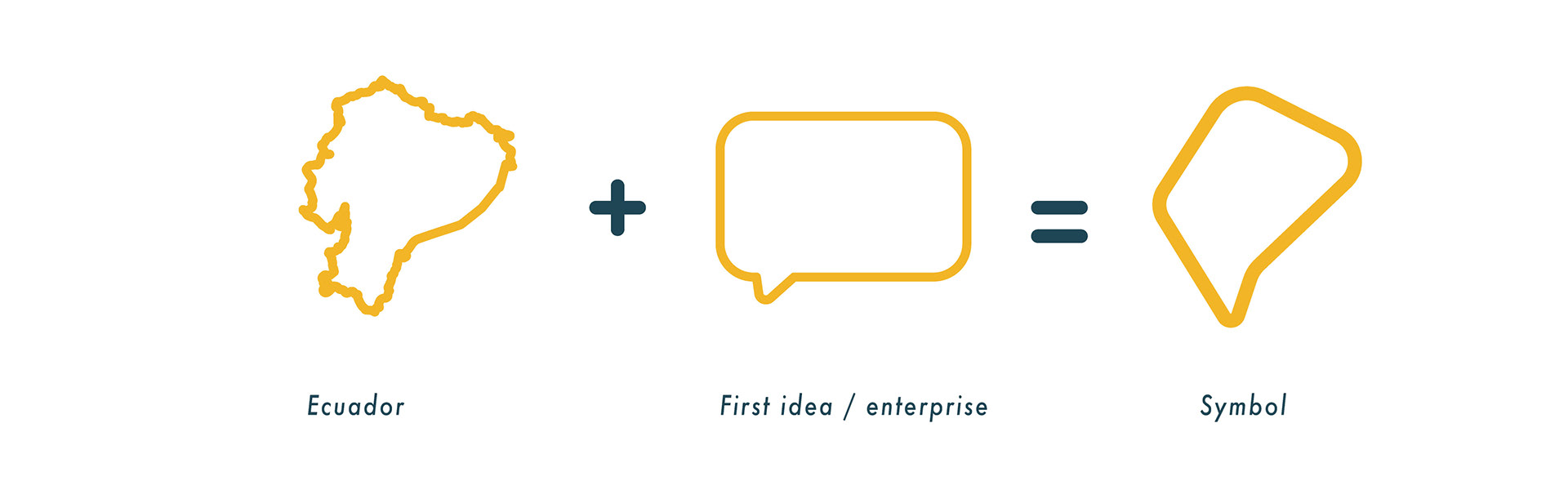
We work in a personal Logotype for the brand, we actually believe that was enough for the brand but the client request make something that represent the Ecuador.
we take the a Line simplification of the country combining with an idea box to represent all those entrepreneurs that want to share their ideas and build that new model of business.
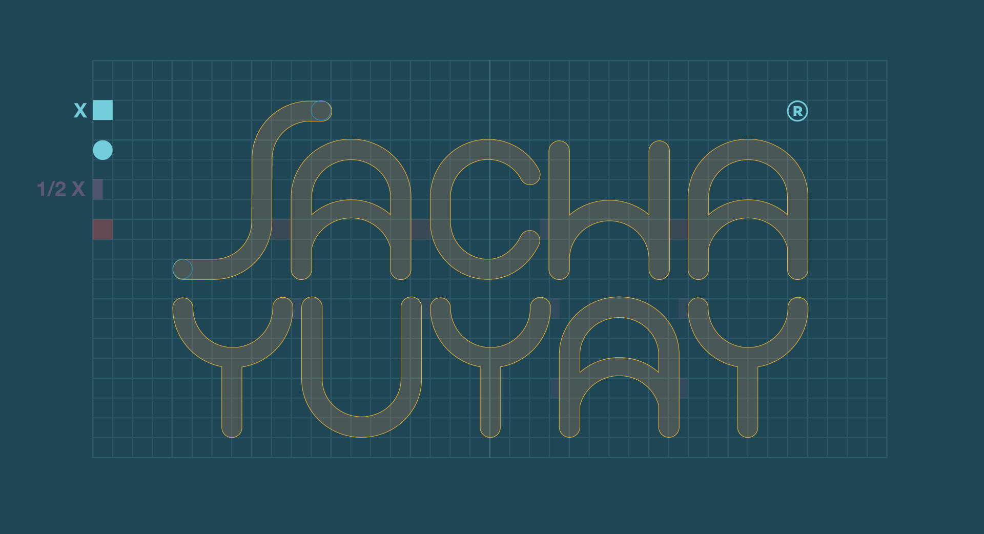
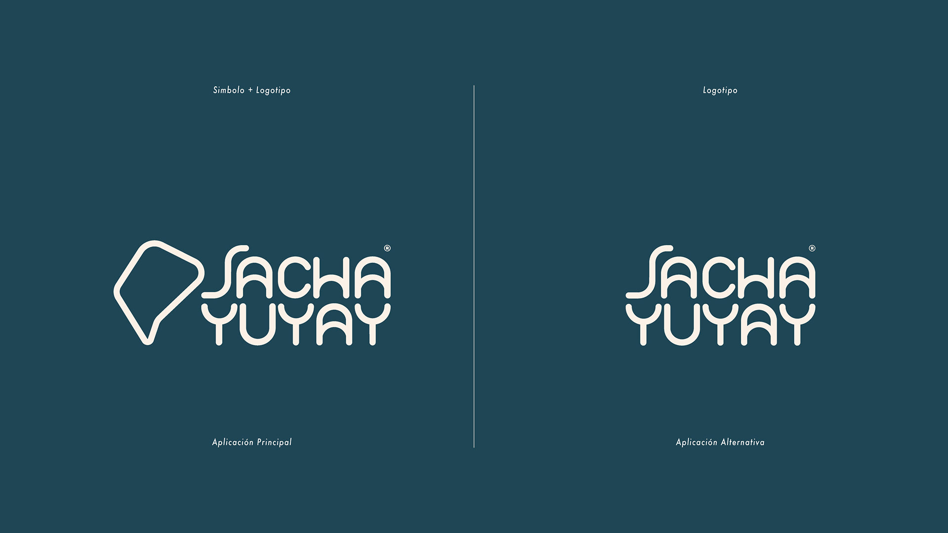
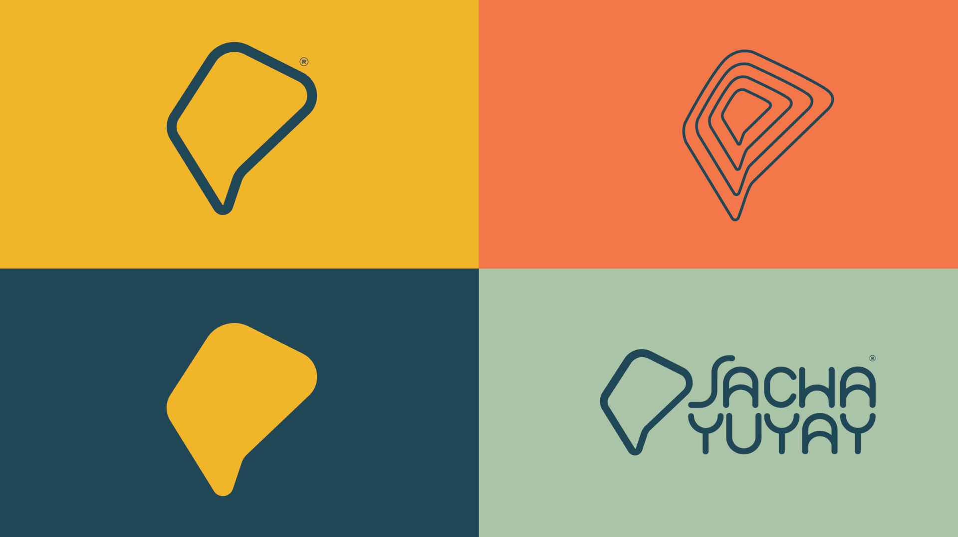
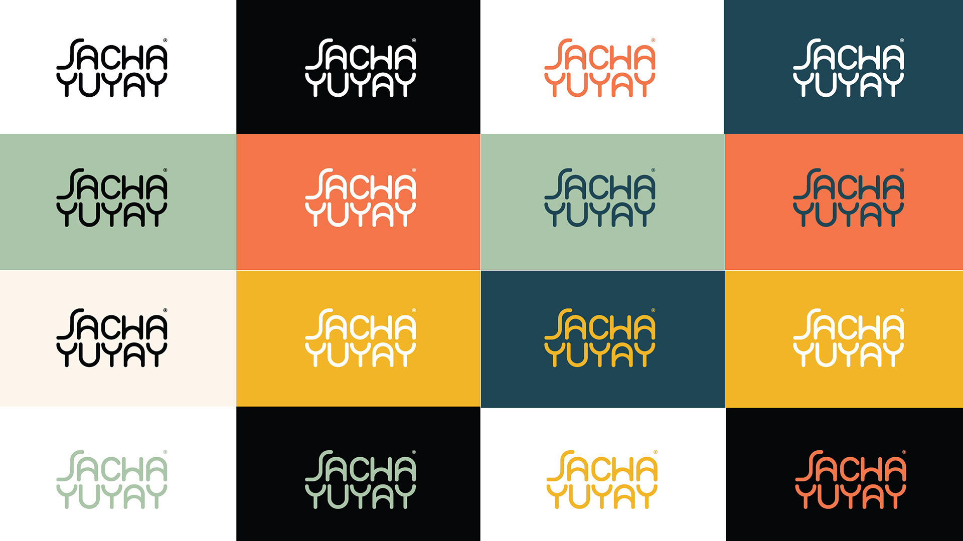
We also want that the Symbol of the brand be completely Flexible to achieve better graphic pieces in case the future projects need it.
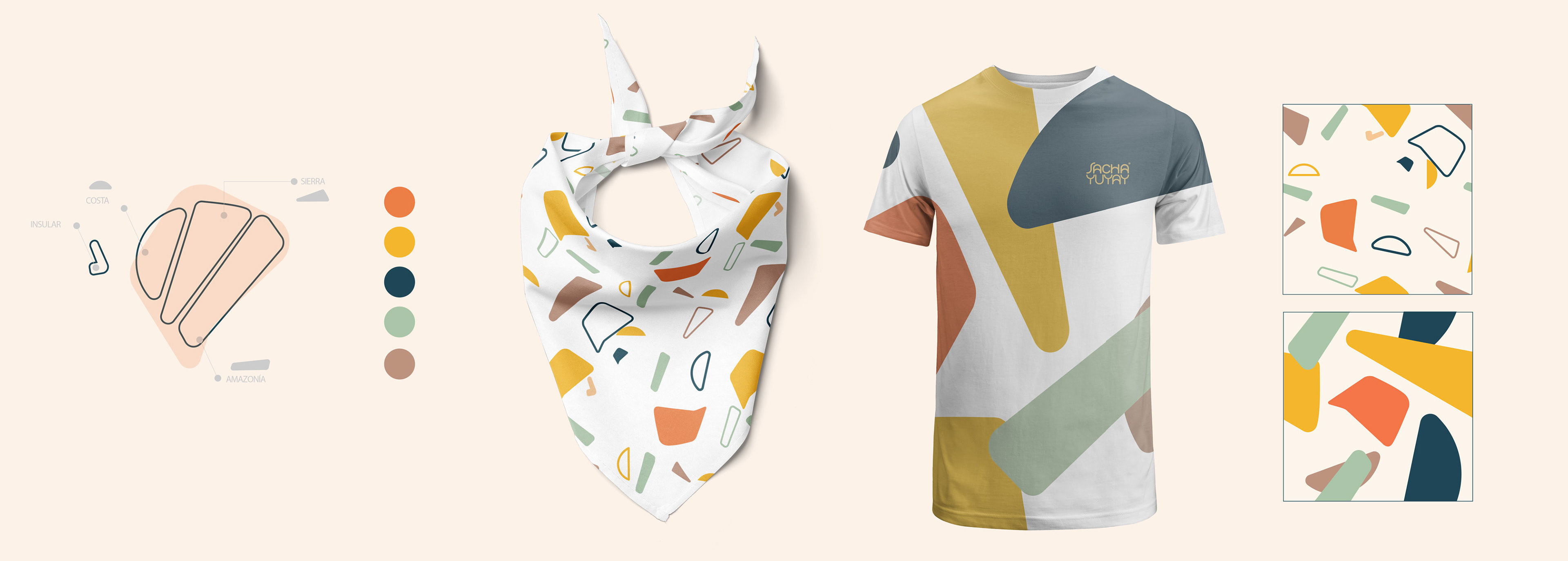
Based on the 4 Region Map of ecuador we made a new simplification this time trying to achieve abstract geometric shapes to use it as Pattern or as graphic resource for the brand so they could use in different products.
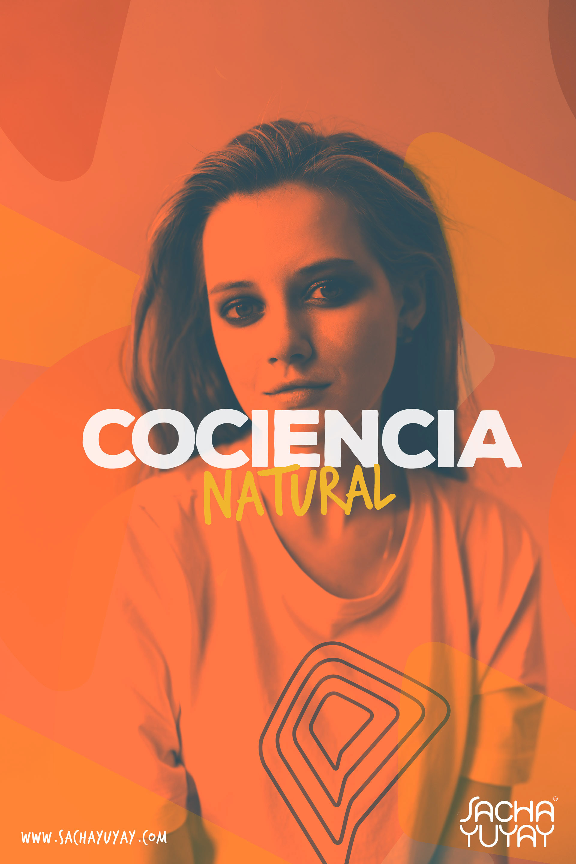
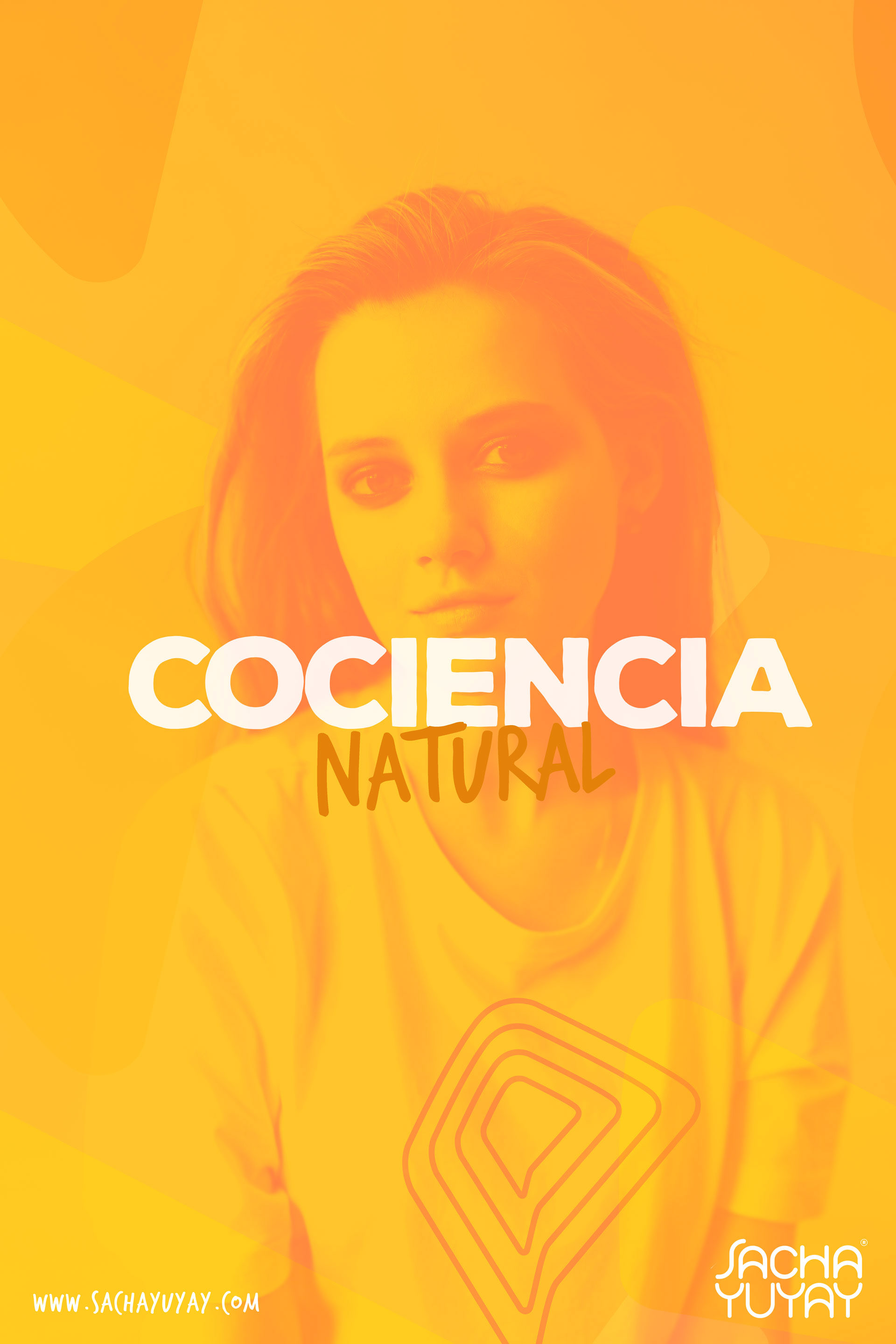
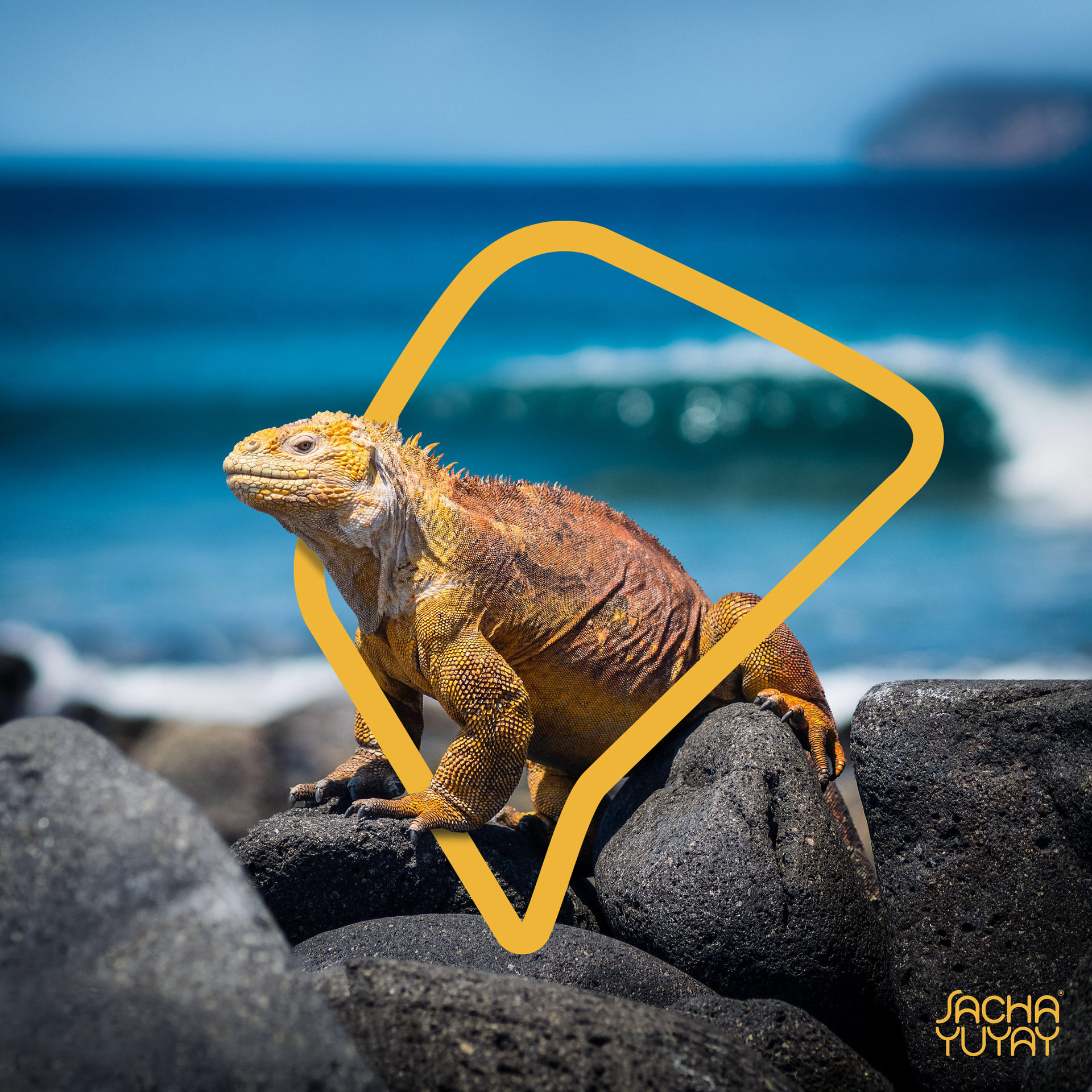
Also another resource for the brand is the Photography style that could be used in normal color or with a Duotone based on the corporate colors , or even use the Symbol as Ornament or Mask window to make more dynamic compositions.

Thanks for Scrolling and Watching.